Posts Tagged ‘Wordpress’

Key Facts Signifying: Whether You Should Add a Sidebar In Your Blog

Friday, August 21st, 2015

When it comes to creating a blog, there are several aspects that we need to consider, ranging from design to content. But, what you might not understand is making the correct use of the sidebar. In fact, chances are that you might not have even given a though to adding a sidebar in your blog. Let’s have a brief overview of what a sidebar actually is.

Sidebar: An Overview

The sidebar has been with us since the time of blogging was introduced. In the blogging landscape or blogosphere (ideally when using WordPress web development), a sidebar is just an area or a space that comes next to your content, so as to help readers pick some content and/or navigate throughout your blog.

A sidebar contains most recent/popular posts, social media links, email sign-up form and much more. No doubt, this information (added in the sidebar) is important in terms of navigation, but it doesn’t add any value to each of your blog post.

Drawing Out Conclusions: Do you Need a Sidebar or Not?

Not to mention, people come to your blog to read the content posted on it. Besides this, your readers may ask questions regarding your blog, by posting comments. And, if they like your content they may even share it on social media networks. For the sharing purpose, you can place social buttons on each of your blog post.

Probably by now, you may be wondering what is the purpose of having a sidebar on your blog? You might even wonder if you actually need one? Let’s have a look at things that can be placed in the sidebar:

1. Ad banner/Promotion

Well, you can use a sidebar to run 3rd party promotions. For example, Forbes run advertisements in the sidebar displayed on the right side of its web page (as shown in the image below):
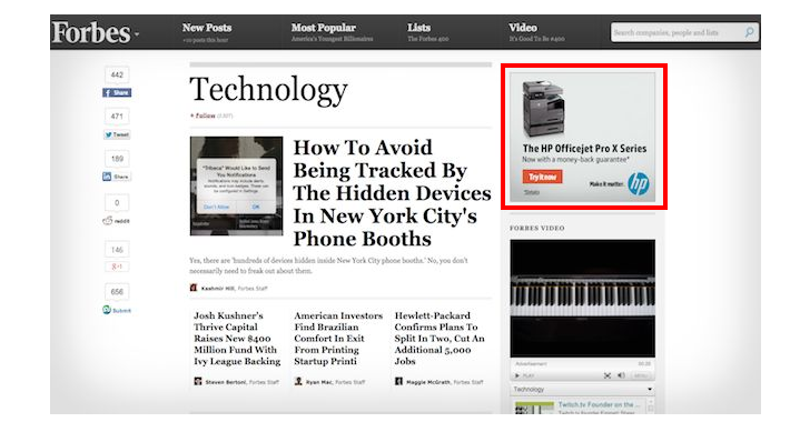
1. Ad banner-Promotion


2. Author Bio, Social Media Buttons and Email Sign-Up Form

You can even use the sidebar to highlight something – that encourages visitors to take some action. For instance, you can add your “author bio” in the sidebar to connect with more readers. This is appropriate for bloggers running longer posts. It’s pretty obvious that most of the users won’t read the complete posts if they’re long. But, by displaying the author bio at the top in the sidebar can get you instantly noticed by your readers. This will eventually help in building a loyal customer base.

Furthermore, you can place your social links in the sidebar or email sign-up. This, in turn, helps in getting repeated traffic. Well, the more people will like your content, the more they’ll share your content via social links, which means more traffic.
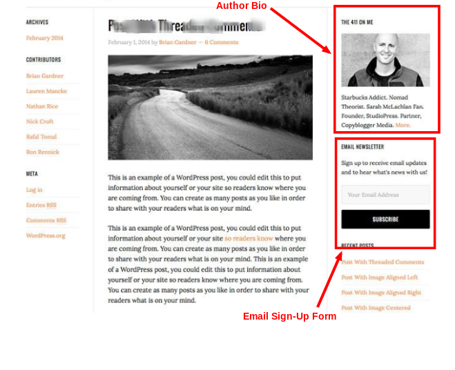
2. Author Bio, Social Media Buttons and Email Sign-Up Form

Are you still not convinced whether adding email or social media profiles will prove effective or not? Then, you’ll be surprised to know that Quick Sprout (a popular marketing blog run by Neil Patel) received 145,971 visitors in just 30 days, from email included in the sidebar.

3. Reviews/Testimonials

This is something that business bloggers can consider: to be added in their blog sidebar. Of course, reviews or testimonials can be posted on personal blogs as well. But, people will most likely prefer reading testimonials posted regarding any business, product and/or service.

If you want to build trust among your users in relation to your products and services, then posting your client reviews and testimonials can make a huge difference between the success and failure of: being able to convert a lead into a potential customer. And when added to a personal blog, reviews or testimonials can help in converting your reader into a subscriber.

However, make sure to position your reviews/testimonials prominently on the sidebar of your blog, as follows:
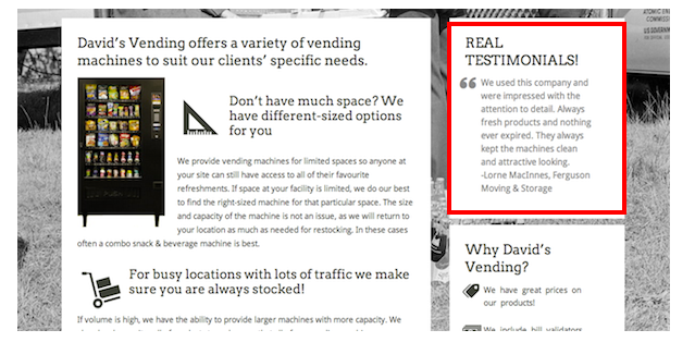
3. Reviews-Testimonials

4. Recent/Latest Posts

Chances are that the main page of your blog might contain the most visited pages – somewhere at the bottom of the blog. In fact, there’s a possibility that your blog posts are displayed in a reverse-chronological list. If that’s the case, then you may lose many readers, who particularly avoid scrolling the blog page till the end, and rather want to devour information presented at the top.

For those users, you can make your recent posts available in the sidebar on the homepage of your blog (not to mention, in the sidebar). In case, you don’t have a sidebar available in your theme, you can hire WordPress development services to have one.

Note: It would be better if you’ll include the recent posts in the sidebar section only if required.

4. Recent-Latest Posts

5. Categories

Finally, you can add categories in the sidebar. It is one of the necessary items of a blog that help group some of your best work (i.e. blog posts) separated by a topic along with an excerpt. Also, they can help in increasing user engagement rate of your blog.

It won’t make sense to show categories somewhere in the middle or at the bottom of your blog page. But then again, content is what you need to present (first) to your visitors. After all, they’re visiting your blog with the purpose to read what all you have to offer. And so, sidebar proves a viable means to display all the categories just next to your content.

So, Do You Really Need a Sidebar?

All of the above discussed key points shows that you can achieve success via your blog, even without a sidebar. However, to make that happen, it is important that you’re able to convey your message in the right manner via your blog.

What’s more?

Despite of the fact that sidebar needs to be included in your blog, it is not necessary to place it each page of your blog. Since having a sidebar on each page can distract your readers. Instead, you can keep it on the homepage and put things (as discussed above) to drive traffic and increase conversions.

Where You Should Place Your Sidebar: Left or Right?

Ok, so now, you would have probably come to know when and where adding a sidebar in your blog page can help you. But, the question that remains is: where you should place your sidebar on the left or the right?

According to the research conducted by “small SEO tools”, it has been observed that most of the bloggers prefer having a sidebar on the right, as it looks visually better. On the other hand, placing sidebar on the left is believed to boost conversion rate. Below are a few key considerations that will help you take an informed decision.

Putting Your Sidebar At Left: Enable users to emphasize on the content rather than navigation. That’s because, many usability studies show that people tend to look at websites in “F-Shaped Pattern”. According to this, in case the sidebar is kept on the left, then what your readers will view in the middle of your blog page will actually be the beginning of its headline, sub-headings, etc.

Putting Your Sidebar At Left

Moreover, Neil Patel while presenting his views on use of the sidebar in the blog also said that: placing a sidebar in Quick Sprout on the left side resulted in 9% bounce rate in terms of users’ reading the blog posts. In contrary, the blog observed an increase in the number of email opt-ins added to the sidebar by 13%.

Also, if you tend to make navigation more prominent to users, you should consider placing it in the sidebar area of your blog.

Putting Your Sidebar At Right: But, if you’re creating a blog with the purpose to educate people, you would certainly have more concern towards increasing the interest of people reading your blog. And this means, you should consider placing your sidebar on the right side of the blog.

In addition, since search engine crawlers would be able to see your content first prior to navigation, you’ll can expect better placement in search engines.

What’s the result?

It is recommended that even though placing the sidebar on the right hand side leads to fewer conversions, it would be better to choose this option. That’s because, people are landing upon your blog to obtain information and to read. And thus, your main objective should be to make your blog content easily accessible to viewers.

Note: If you still want to know how to choose whether to add a sidebar on the left or right side, then you can create two versions of your blog page: one having sidebar on the left and another with a sidebar on the right. And then, perform split tests to see the result which includes information about conversion, bounce rate and so on.

Wrapping Up

In case, you’re not having a sidebar in your blog, then you should definitely consider including one without much ado. Although, it may not add value to individual pages of your blog, but offers several other benefits as discussed in this post.

If you already have a sidebar on the blog, the next thing to consider is placing it on the right side of the blog page containing elements such as author bio and email sign-up forms. Also remember that in case you own a corporate blog, then rather than bio, it would be better to include an excerpt about your brand in the sidebar.

And if your goal is to maximize conversion rate, then you must get rid of the sidebar from all the pages of your blog.

Author Bio :

Sophia Phillips has been a professional HTML to WordPress theme conversion expert since many years from now. She has a remarkable expertise in converting the markup of simple and complex HTML websites into WordPress. If you too are thinking about switching to a new markup for your existing site, then do get in touch with Sophia via her account.
14 Simple Pointers You Can’t Ignore While Choosing A WordPress Theme

Friday, August 14th, 2015

The wonderful flexibility of choosing from tons and tons of WordPress themes often makes it quite tedious to settle down for the right one. In the wake of getting their WordPress blog/site up and running in no time, a majority of webmasters tends to resort to inefficient and low-quality WordPress themes that end up causing irreparable harm to their online presence. Hence, it is better to stay informed about all the exquisite things that need to be considered for curbing the uncertainty associated with choosing the best suited WordPress theme.

In today’s post, you’ll get to know about 14 most crucial pointers that need to be paid special attention to, during the selection process for WordPress free or paid themes. So, let’s take a closer look at the things you need to keep in mind while hand-picking the perfect theme among a huge collection of WordPress themes.

Wordpress Theme

  1. Analyze the type of website that you’re intending to build

Never get seduced by the stunning designs of WordPress themes, rather, be clear on the type of website that you’re planning to create. For instance, if you’re about to build an e-commerce website, choosing e-commerce related WordPress themes will prove beneficial. On the contrary, you may also opt for the multi-purpose WordPress themes that allow you to showcase any type of business with any target audience.

  1. Check whether the theme you’ve shortlisted for your website is accompanied by an easy setup

A WordPress theme that takes long hours or even multiple days to setup should never be chosen, irrespective of whether it comes to you for free or for a small fee. Hence, prior to choosing a WordPress theme, it is recommended to check whether the same comes with an easy setup or not. Possible ways to finding the complexity of theme setup is by noticing the things below:

  • Whether or not the WordPress theme seller is offering any setup documentation?
  • Whether your website content matches with the one displayed in the theme’s demo?
  • Whether the theme seller is inclined on offering any open support forum?

Theme Design

  1. Check out whether the WordPress theme is enriched with Third-party plugin support and compatibility

The more compatible a theme is with a plugin, the better it is for the overall speed and performance of a WordPress powered blog/website. Hence, while picking a theme for your WP blog/site, don’t forget to check for the third-party support and compatibility feature. Some of the most popular plugins that your theme should be compatible with, include BuddyPress, WPML and bbPress.

  1. Check the level of customization available with the WordPress theme

The capability of changing the look and feel of a theme is simply unbeatable. With the huge crowd of free and premium WordPress themes, it is imperative for you to choose the one that can be customized with utmost ease and flexibility. While some WordPress themes come with a default customizer, allowing webmasters to change the visual appearance and functionality of the theme; there are other WP themes which expect the webmasters to rely on PHP and CSS code for tweaking the way the theme looks and works.

  1. Simplicity is the word for an ‘Outstanding’ WordPress theme

The web market is flooded with free WordPress themes that comprise of complex features. Though such themes might look truly stunning in their display, they might not turn to be the best asset for your WordPress site. Hence, I suggest you to stay away from the fancy world, rather go ahead with choosing a WordPress theme with simple design. Easy modification and cross-browser compatibility are two of the best known advantages of using a simple WordPress theme.

  1. Ensure that the theme you choose for your WordPress portal is mobile-friendly

Mobile Friendly Theme

If a majority of reports are to be believed, about 30% of all website visits are being received from mobiles, tablets and other hand-held devices. Considering this, you can’t do away with the utmost urgency of installing a fully responsive theme onto your WordPress website/blog. Fortunately, a huge collection of WordPress themes available in the web market is mobile-friendly by default, but it is always better to check with the vendor whether the one you’re shortlisting is 100% responsive.

Check for a clean and intuitive navigation in the WordPress theme

Despite the amount of time, money and effort that you put into making your website beautiful and feature-rich, a poor navigation can easily make your layout look cluttered, keeping the visitors annoyed. Hence, in order to refrain visitors from leaving your website/blog, it is recommended to choose a theme that has an intuitive navigation system, allowing visitors to navigate through different sections of the website.

  1. Check whether the theme is accompanied by a Pre or Post-Sales Support

During the process of shortlisting a suitable theme for your WordPress blog/site, it is advised to spend some time on identifying the pre and post-sales support that is available with the respective theme. For instance, there is a good count of WordPress stores and marketplaces which render open access to their customer communication areas and support forums. Additionally, you may choose to get in touch with the theme’s support team via telephone, email etc.

  1. Check whether security and compatibility patches would or wouldn’t be released for the WordPress theme

During the process of shortlisting a WordPress theme for your website/blog, it is better to pick up the one for which you’re sure enough that the security and compatibility fixes would be released without a fail. For instance, after six months of using the WordPress theme, you must be confident about receiving a reply regarding your specific queries. All in all, it is better to choose a themes company that has been into the business of designing and delivering bug-free WordPress themes backed by a strong support team.

  1. Check whether the theme comes with social media integration feature

Today, it is quite unusual to find a user who doesn’t have an account on any of the popular social media platforms. Hence, if you are running a WordPress powered blog or website, you might be interested in attracting users to comment/share or like the posts that have been published on your portal. It is a cool and trendy WordPress theme (equipped with social media integration feature) that allows you to make the most of your social media presence via enhancement in total page views.

  1. Unique designs make for a perfect WordPress theme

As the WordPress webmaster, your intention to stand apart from your competitors can meet its end if you opt for a theme with 100% unique design. The web market has a good suite of WordPress themes which are an accurate replica of other popular themes. You should stay away from such themes and instead choose the ones which are completely interactive and loaded with several features like tons of page builder shortcode modules, free fonts, layouts and a lot more. Check out whether the theme that you’re about to settle down for has a perfect blend of contemporary web design trends like full-width visuals, grids, ghost buttons, slow load effect etc.

  1. Get to know about the Terms of Service associated with the WordPress theme that you’re planning to choose

Irrespective of whether you’re excited about choosing a free or a premium WordPress theme, a timely knowledge about the Terms of Service related to the theme is greatly befitting. For example, there are several free WordPress themes which expect multiple backlinks. You must avoid installing such themes and instead opt for a different free theme which doesn’t come with too many backlinks. Moreover, do check out the Terms of Service laid down with the theme. Doing this will act as a guarantee that the hardwork of the theme designer is being appreciated and that the theme won’t lose its credibility in any way. Browse through the free-to-download WordPress themes available in the WordPress’ Official Themes Directory. Here, you’ll find a wide array of good themes that come with simple terms of service.

  1. Look for a WordPress theme that’s loaded with shortcodes

Shortcodes serve as the right means of attaching media data to your WordPress posts and pages. Hence, get on with looking for a theme that comes with shortcodes out-of-the-box, allowing you to embed audio, tabs, video, grids, lists and Google Maps into your WordPress website.

  1. A WordPress theme that relies on the Cherry framework shouldn’t be missed

Launched by TemplateMonster, Cherry framework has served as the parent framework for a whopping 900+ child themes. Equipped with multiple shortcodes, widgets and Bootstrap options, Cherry framework has an admin panel that resembles the traditional WordPress admin interface. That means, even a non tech-savvy individual can quickly set up a WordPress website/blog within minutes. WordPress themes that rely on the Cheery framework are by default loaded with stunning WordPress features like XML Sitemap generation, custom post creation, easy import/export data procedures, SEO optimization and many more.

Final Thoughts

The kind of theme that you install on your WordPress site/blog will determine the fate of your online presence. Hence, take my words and pay heed to each of the above mentioned pointers to get hold of the WordPress theme that looks awesome and allows you to achieve your kind of web-based portal.

Author Bio: My name is Andrey. I am a web developer in CMS Web Development Company. I am fond of finding simple solutions to complex problems. If you loved the topic, do share and comment. Also, you can follow me on Twitter for more updates.

See How Your Website Appears To Visitors

Monday, May 7th, 2012

I get easily blown away any time i discover what features or tools you can use to optimize a website.

There is a tool i just found out and it was created by a Google engineer. Google engineers are given opportunities to personally pursue projects as per ideas they conceived. It was during this moment of opportunity that this Google engineer created this feature.

This tool is the browser size tool

The feature helps to discover generally how much of your website is easily visible to readers. Websites appear differently to readers because of the sizes of their monitor screens, the browsers, the toolbars installed and so on. Thus some very important part of your website might not be easily visible to some readers unless they scroll down or sideways the page. Believe me some visitors do not bother to scroll through your page.

This I find very useful to website owners; especially if you have adverts or donate button positioned in places on your website. After checking out your website with this tool, you might want to reposition that advert so that it can be easily seen and clicked by visitors. Isn’t this a lovely revelation?

But you interested in how I found this out?

I made a call to a friend asking him to check out my website and make a comment on the design. He reported back to me that my website was okay but that it had just 2 Google adverts by Google and suggested I should include a last one allowable by Google. I replied that i had all 3 ads on the site. He checked again but this time he had to scroll the page before he could see the website. I immediately noticed and recognized this problem and jumped into the Google search engine to search for how I can correct this issue.

But then I decided to find out first how my website does look like to readers and boom………I bumped into this wonderful tool.

Whenever you are at the newspaper stand, you will see the front page headlines at the top of the newspapers before anything else. You won’t see the bottom headlines of some newspapers because it is folded. This is why adverts placed at the top of newspapers are more expensive than their counterparts placed below. This is also the same concept of how a website appears to the visitors at first sight.

So go check up your blog or website now and see if there are things that are hidden but you need to be visible on first look. Go to www.browsersize.googlelabs.com. Once you get there, type in your website url and you have a view of what we are talking about here.

About the author: Jide is an internet publisher. He publishes in hubpages and he also publishes jobs in jobnetworknigeria, a job platform where job searchers finds new jobs in Nigeria.

New Premium WordPress Theme For Nigerian Entrepreneur

Thursday, May 20th, 2010

Irrespective of what people may say, the truth remains that the design and layout of a blog matters. Right from the launch of this blog, I’ve always try to use a blog design that will present my content in a simple but professional way. That has been my reason for always wanting to use a premium wordpress theme. Since premium wordpress themes are usually commercial, only few are truly free premium themes, it then means I can’t change the blog theme as often as I like.

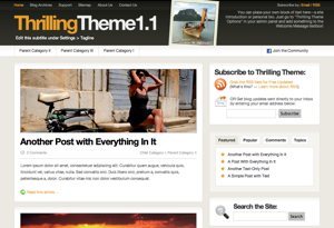
Thrilling WordPress ThemeYou may be wondering why I can’t just save myself the whole stress and pay something like $50 to get a premium wordpress theme installed. Well, I’ve always tried to use free resources for this website (except in a situation whereby it is not possilbe to do so). Since the blog is an attempt to prove to would be Nigerian online entreprenuers that they can replicate the success of this blog, it then means that I need to go about things using a shoe string budget as much as feasible.

For those of you that have been a fan of this blog for some years now, you will notice that it’s been over a year since I changed the theme of Nigerian Entrepreneur. After several months of procastinating because I consider the task of tweaking a free premium wordpress theme and getting the layout right a task I will rather not do. (I actually prefer blogging to having to tweak codes, html, css, etc.Like I said earlier, if I were to have my way, I would simply have outsourced the design of the blog).

Well, I finally gave in yesterday and introduced a new look using the premium theme Thrilling Theme from www.thrillingheroics.com The theme has a beautiful design and simple layout. Guess what, I actually got a copy of the theme in 2009, but I was afraid of the tweaks I will need to make to get the layout right. So, I kept prostponing switching from my former wordpress theme, Revolution Code Blue to Thrilling Theme.

I felt is was time to change the look of Nigerian Entrepreneur since over a month ago. However, I was not confident enough to switch to te new theme then because when I previewed it, there were several things that were broken. I simply told myself that when I’m less busy, I will do the change so that I will be ready to correct anything that gets broekn. Well, I never get the break until yesterday I when I simply told myself, that a better time may never come. It is better to switch and then start fixing whatever is broken one step at a time until it is all fixed.Just like there will never be a better time for you to start that small scale business you’ve been dreaming of. You just have to take the first step instead of allowing your fear to cage you and keep you incapacitated.

Well, I finally got over my fear and activated the theme yesterday. Since then, I’ve been under the hood tweaking codes and getting rid of some widgets in other to get the layout that I desire. After 24hours, I’m yet to get a perfect layout like I desire. But I fell better now that I have taking the first step of changing the theme. Nigerian Entrepreneur now have a new look. Apologies to my fans that visited when all the layout were heavily in disarray. Things are begining to take shape now.

I will love to hear your views about the new look and how easy it is to get at the information you need. Your suggestion will assist me in making corrections where I need to. Much more I wish to use this opportunity to thank you all for your comments. That is my greatest motivation. You are the reason why I still blog even when I don’t feel like. I guess that is enough rambling about the change I just made.

If you love the new theme, please say so in the comments. If you have an objection, feel free to express your thought. Like I mentioned earlier, the theme is a free premium wordpress theme. It has options that you can easily tweak from the admin dashboard. Also, you can do whatever you wish with the theme because it is  open source! For your copy, visit www.thrillingheroics.com. Cheers.

Website Designer

Wednesday, April 22nd, 2009

You too can become a professional website designer. Website designing (also known as website developing) has become one of the most lucrative online business opportunities that many online entrepreneurs are using to earn money online. Professional website designers are very much  in high demand especially in the developing countries located in Africa and Asia.

Benefits of a Website Designer Business

The beautiful thing about website designing business is that your geographical location doesn’t matter. You can easily set-up shop and operate from anywhere in the world! For example, your clients can be located in a remote village in Uganda or Benin Republic while you are staying with a laptop at a resort hotel somewhere in Bahamas, it doesn’t really matter.

Also, as a website designer, you can easily generate multiple streams of income by adding other services that are related to website designing. For example, as a professional website designer, you can offer the service of Search Engine Optimization (SEO), Website Traffic Generation, Article Submission and other website promotion services. When you client base is yet small, you can even offer to be the pioneer webmaster for your clients until they are set to get a dedicated staff for such duty.

Skills Needed by a Website Designer

In order for you to become a professional website designer. You need to acquire some skills. Some years back, that would have been a great discouragement for those that are not technically oriented. If you were to be a professional website designer in the early 1980’s you would have needed to learn how to design a website with some complicated HTML codes.

In the 1990s, great stride was made to make the lives of website designers easier. Some sophisticated website design software such as Dreamweaver, Microsoft Front Page etc. were introduced. The software helped to cut the work of website designing to about half of what it used to be. But then, the software were pretty expensive and many could not afford to purchase them. The few free website design software were not able to produce the same result. Beside the high cost of buying the website designing software, a newbie website designer still need to spend hours learning how the software works.

That is no longer the case now. Instead of a website designer struggling to learn HTML, CSS, DHTML, Ajax and other website development tools or spending a fortune to buy Dreamweaver, there is a cheap alternative. A newbie professional website designer can now use any of the free Open Source CMS (Content Managment System) tools to design professional websites. Some of the most popular CMS that any determined person can easily learn are WordPress, Drupal, Joomla, etc.

Content Management System for Website Designers

The beauty of a CMS  tool is that the program already has a well designed website-skeleton that keeps the entire structure of a website together. You do not need to break your head worrying about  how to pull together the various sections of a website and ensure that they work in harmony. Also, many of them takes care of compatibility of your website design with different internet browsers.

These benefits makes CMS the best launch pad for a website designer career. If you learn how to use a CMS program to develop a website, you can later add to your knowledge and develop your skill by learning HTML, DHTML, CSS, Ajax etc. This is not an afterthought, it is recommended. You can’t claim to be a real professional website designer if all you know is how to use keyboard and mouse clicking at widgets 😉 It is ok to start that way, but you must add to your knowledge if you really want to be competitive in your online business. If you are scared of that, then be ready to outsource some complicated jobs you get to well tested website design professionals (at least you will still earn some profit from the deal).

WordPress 2.7

WordPress 2.7

Why start Website Design with CMS tools?

The reason why I recommend starting your website designer career with CMS is because you can actually create a website from scratch without any prior knowledge of website designing by using such tool. For example, WordPress 2.7 is so simple that the only pre-requisite skill it requires for you to design a website is the ability to use a keyboard and mouse while following step by step instructions written in English (or any other human language).

Website Designing as an Online Business

If you have been looking for online business ideas that you can safely implement without spending a fortune, website desining is one of such. It is cheap to start and yet it has great earning potential even for a newbie online entrepreneur. I can easily prove that to you.

Take a look around your locality, how many of the small scale business owners have their businesses online? Too many small scale business owners are still internet shy. The situation is worse in developing countries. If you package a presentation and you are able to convince them to give you an opportunity to take their business online and manage it for the first 3months, you will have enough client to get you busy earning money online. You may actually end up firing your boss and hiring some staff 😉
Beside those entrepreneurs that have no web presence, (as you master the use of CMS tools for website designs), you can take a step further in your business by contacting those small businesses whose website are so poorly designed that they look like scrap books made by a five year old. You will be able to convince them by showing the previous jobs you’ve done.

I guess you no longer have an excuse for not starting an online business. I have just giving you an online business idea that is both easy to implement and yet lucrative. Go start a website designer business now! Your future is bright.

You can get a free update to this post Website Designer by subscribing to my RSS feed. It is free. If you have a question or contribution to the discussion, feel free to drop it in a comment. Cheers.